Mapping COVID-19 data in France with R
The French government has this website called data.gouv.fr with a lot of open access data, including data on how the COVID-19 crisis impacts the French healthcare system. Here, we can find a dataset with the number of people in intensive care units for every french department.
This data set contains a lot of interesting information, including data on how the COVID-19 crisis affected the Grand Est region. Unfortunately, it is the kind of data set which is hard to make sense of at first glance.
covid_department_dataset <-
  readr::read_csv2("https://www.data.gouv.fr/fr/datasets/r/63352e38-d353-4b54-bfd1-f1b3ee1cabd7")

head(covid_department_dataset)
# A tibble: 6 × 10
  dep    sexe jour        hosp   rea HospConv SSR_USLD autres   rad    dc
  <chr> <dbl> <date>     <dbl> <dbl>    <dbl>    <dbl>  <dbl> <dbl> <dbl>
1 01        0 2020-03-18     2     0       NA       NA     NA     1     0
2 01        1 2020-03-18     1     0       NA       NA     NA     1     0
3 01        2 2020-03-18     1     0       NA       NA     NA     0     0
4 02        0 2020-03-18    41    10       NA       NA     NA    18    11
5 02        1 2020-03-18    19     4       NA       NA     NA    11     6
6 02        2 2020-03-18    22     6       NA       NA     NA     7     5
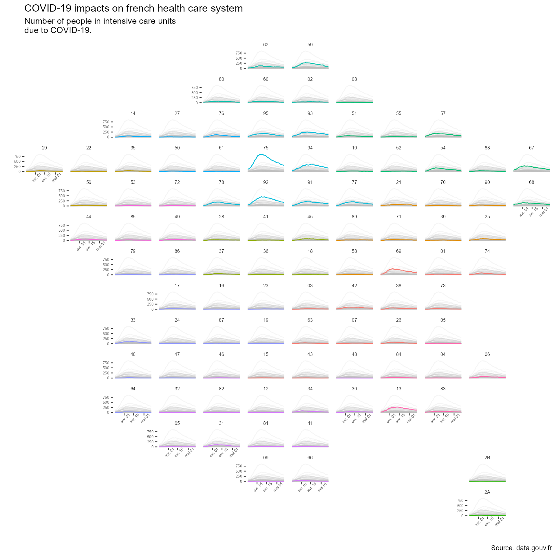
To better vizualize the dataset, we will create a map where we would show the COVID-19 data for each department. This kind of map has been used before, for example showing US unemployment rate between states. Here, we will try to create a map of France where every department is a subplot. These subplots will be line graphs with the number of person in intensive care units on the y-axis and the date on the x-axis.
TO do so, we will use an R package that is dedicated to the creation of
such plots. The geofacet R package works with ggplot2 to create
subplots according to a geographical grid. The only information that it needs is
the data set containing those data we want to map (that we already have)
and a data set that is setting up geographical data on a grid.
First, let’s start by loading a few packages that could be useful.
library(tidyverse)     # general wrangling of the data
library(googlesheets4) # to work with google sheets

library(lubridate)     # to work with date

library(geofacet)      # the geofacet package
library(gghighlight)   # add color to the different part of the plot
We will then create a data set with the geographical grid we want to use. For
France, we can easily create the grid data set on
googlesheet
and then import it into R. The data set is available here, and we can import it
into R in two lines thanks to the googlesheets4 package (note that you probably
will have to call the gs4_auth function at some point).
departments <-
  read_sheet("1hKY0kjzLm55q1R2jD7FmbRkC6XTb0El4oEbVvi98pwo",
             sheet = "departement")
Now, because we’re greedy and because googlsheet4 is easy to use, we can
decide to create a second data set so we can add each department’s regional
information.
regions <-
  read_sheet("1hKY0kjzLm55q1R2jD7FmbRkC6XTb0El4oEbVvi98pwo",
             sheet = "region")
The wrangling we need to do to prepare the data set is minimal. We just have to remove french departments that we don’t want to plot and add for every department its regional information.
covid_department_dataset <-
  covid_department_dataset |>
  semi_join(departments,
            by = c("dep" = "code")) |>
  left_join(regions,
            by = c("dep" = "code")) |>
  filter(sexe == 0) |> # Because we don't want to make gender-based
                       # analysis, we keep the overall results
  filter(jour <= ymd("2020-05-12"))

head(covid_department_dataset)
# A tibble: 6 × 13
  dep    sexe jour        hosp   rea HospConv SSR_USLD autres   rad    dc name
  <chr> <dbl> <date>     <dbl> <dbl>    <dbl>    <dbl>  <dbl> <dbl> <dbl> <chr>
1 01        0 2020-03-18     2     0       NA       NA     NA     1     0 Ain
2 02        0 2020-03-18    41    10       NA       NA     NA    18    11 Ainse
3 03        0 2020-03-18     4     0       NA       NA     NA     1     0 Allier
4 04        0 2020-03-18     3     1       NA       NA     NA     2     0 Alpes…
5 05        0 2020-03-18     8     1       NA       NA     NA     9     0 Haute…
6 06        0 2020-03-18    25     1       NA       NA     NA    47     2 Alpes…
# … with 2 more variables: region <chr>, inhabitant <dbl>
Now, we just have to create the plot using the covid_department_dataset. Note
that, to make the plot easier to interpret, we can use the gghighlight
package that works well with the ggplot2 faceting system.
covid_department_dataset |>
  ggplot(aes(y = rea,
             x = jour,
             color = region,
             group = dep)) +
  geom_line() +
  gghighlight(unhighlighted_params = list(alpha = .15)) +
  facet_geo(~ dep,
            grid = departments) +
  labs (x = "",
        y = "",
        title = "COVID-19 impacts on french health care system",
        subtitle = "Number of people in intensive care units\ndue to COVID-19.",
        caption = "Source: data.gouv.fr") +
  theme(text = element_text("Roboto"),
        plot.caption = element_text("Roboto"),
        strip.background = element_blank(),
        panel.background = element_blank(),
        strip.text = element_text(family = "Roboto",
                                  size   = 6),
        axis.text = element_text(family = "Roboto",
                                 size   = 5),
        axis.text.x = element_text(angle = 45),
  )